I am happy to announce that a long time coming project went live today. Congrats to Nightowl Denmark and its founder, Jørgen Rasmussen on his new venture!
Taking on a niche and to have the courage to look different than all the rest in the tourism-bunch, is the kind of client I respect!
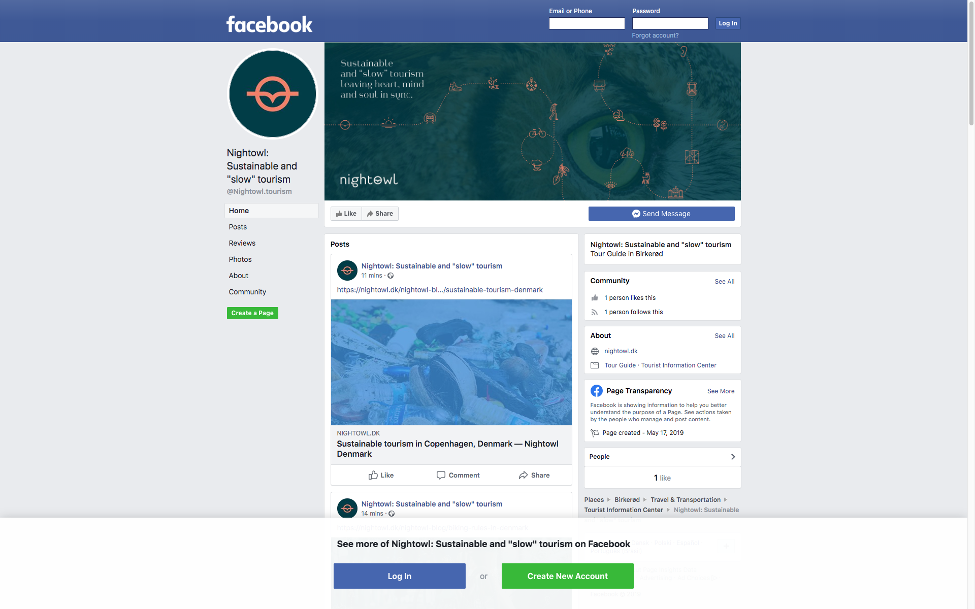
Nightowl Denmark – a bold new startup with an experienced and passionate guide – based in Denmark. Nightowl is the first to base every trip on supporting ecological and being kind to nature. Nightowl is a business founded on passion, on giving back to Mother Nature, revealing local gems, leading the way on how to be planet-friendly. It’s been my pleasure to collaborate on creating a 360 degrees visual identity, from start to finish with Jørgen. It is always special when client and designer match.
Project:
Concept development, art direction, support
Webdesign, designing graphic content, finding imagery, layout.
Custom coding, technical setup, email signature.
Visual identity: businesscards, wordmark, submark, icons, illustrations, social media banners.
Visual identity – versatility:


Paperline for Nightowl Denmark


Wordmark and icons on extra thick business cards with matching orange middle.

Submark with tagline
Wordmark and Submark
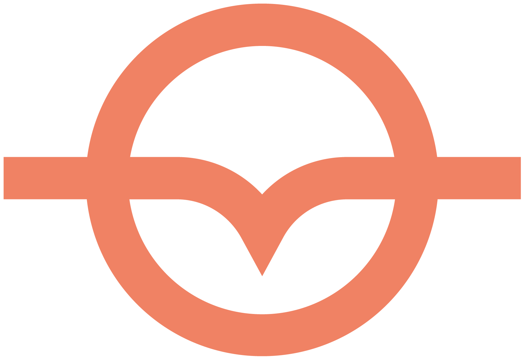
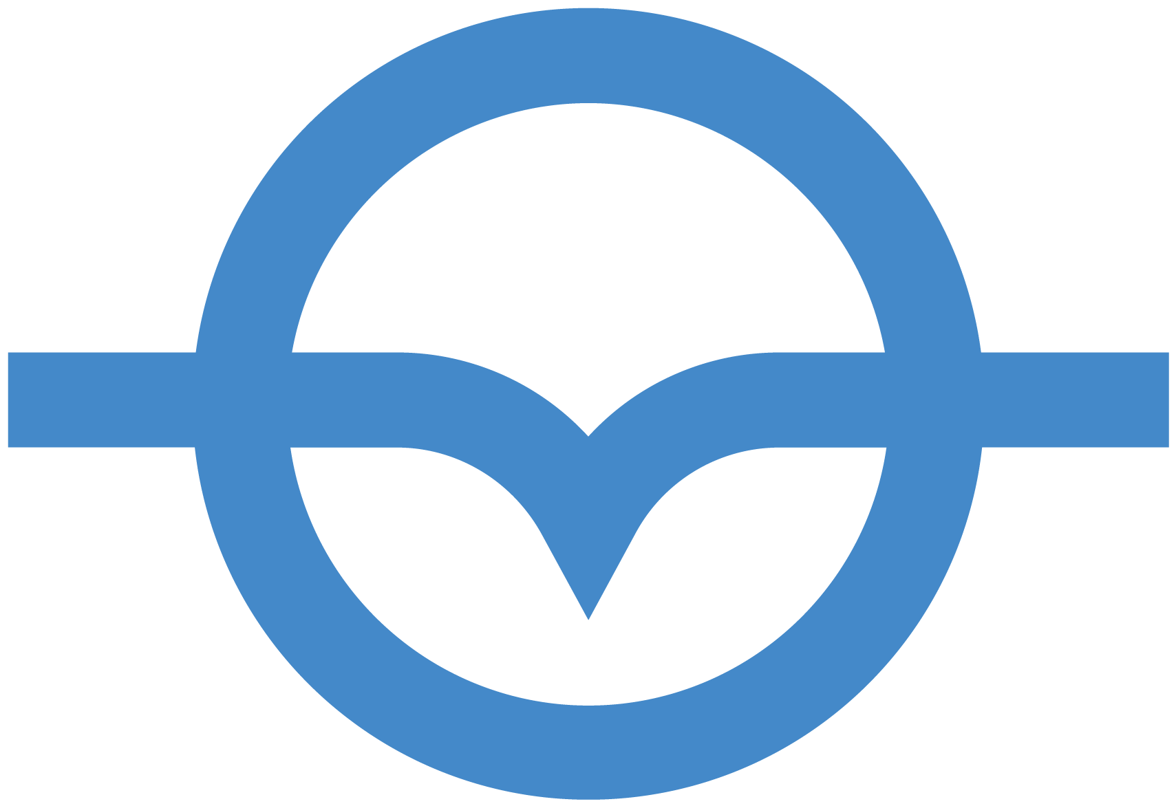
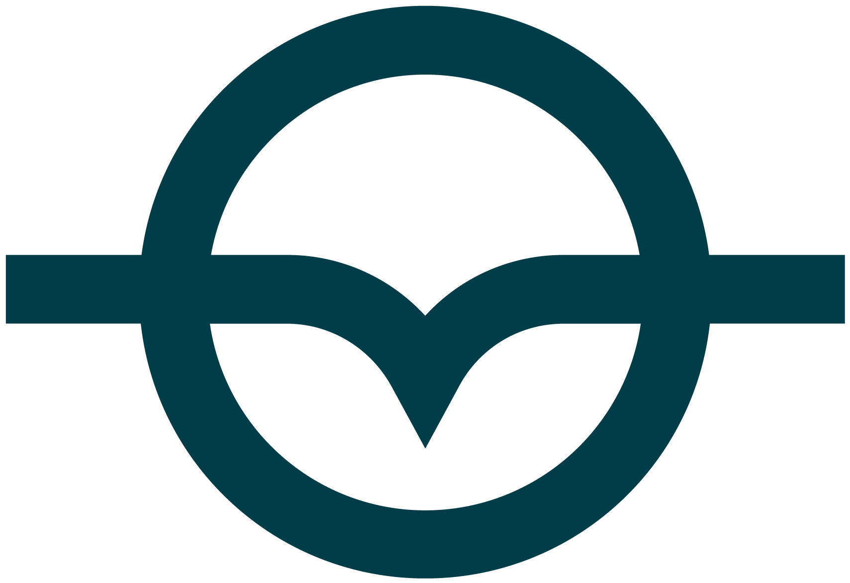
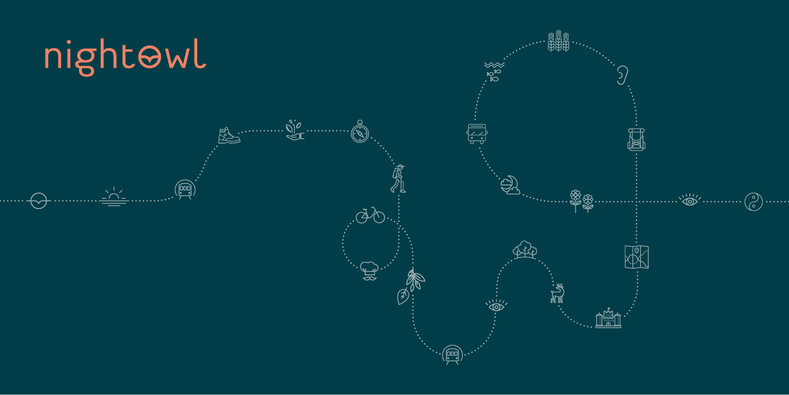
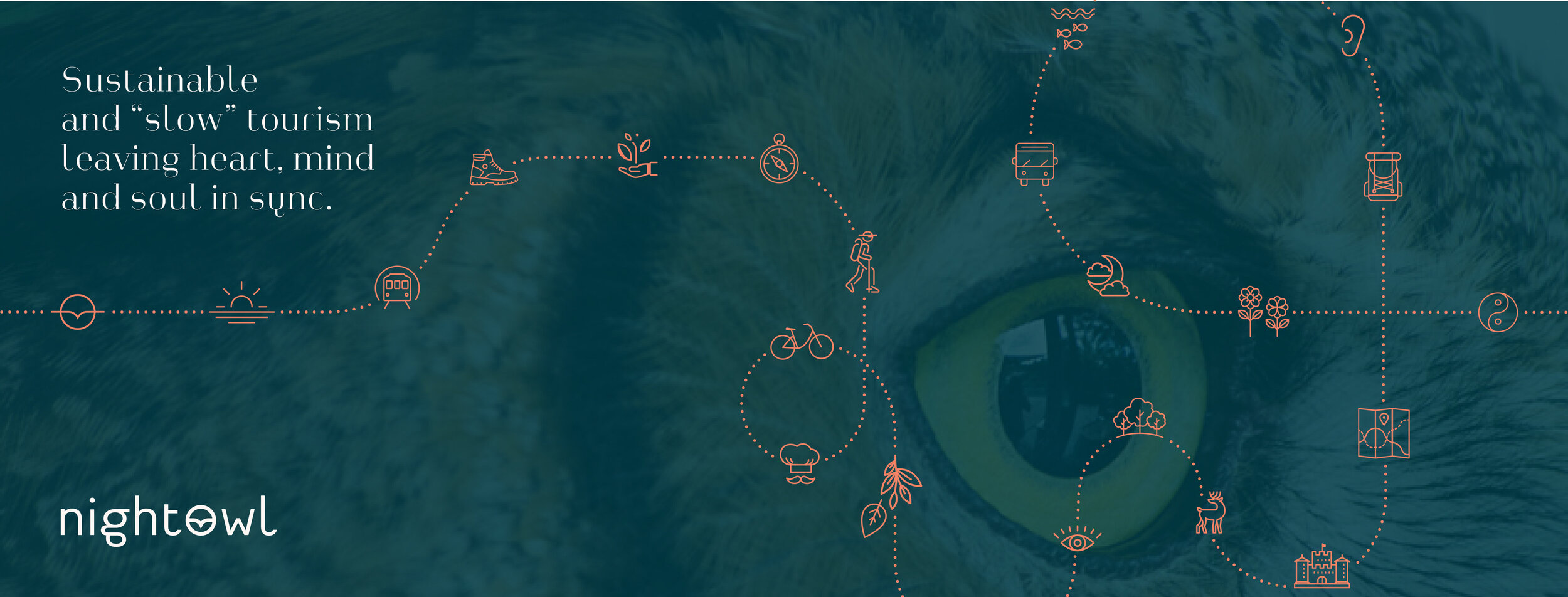
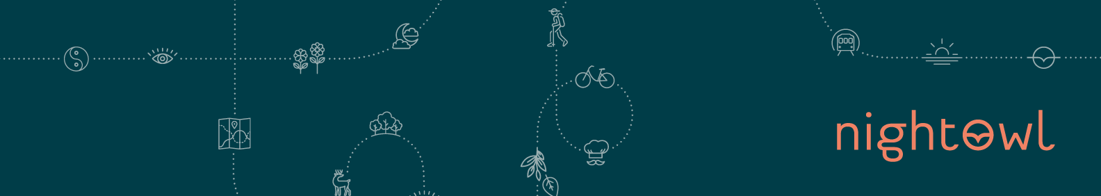
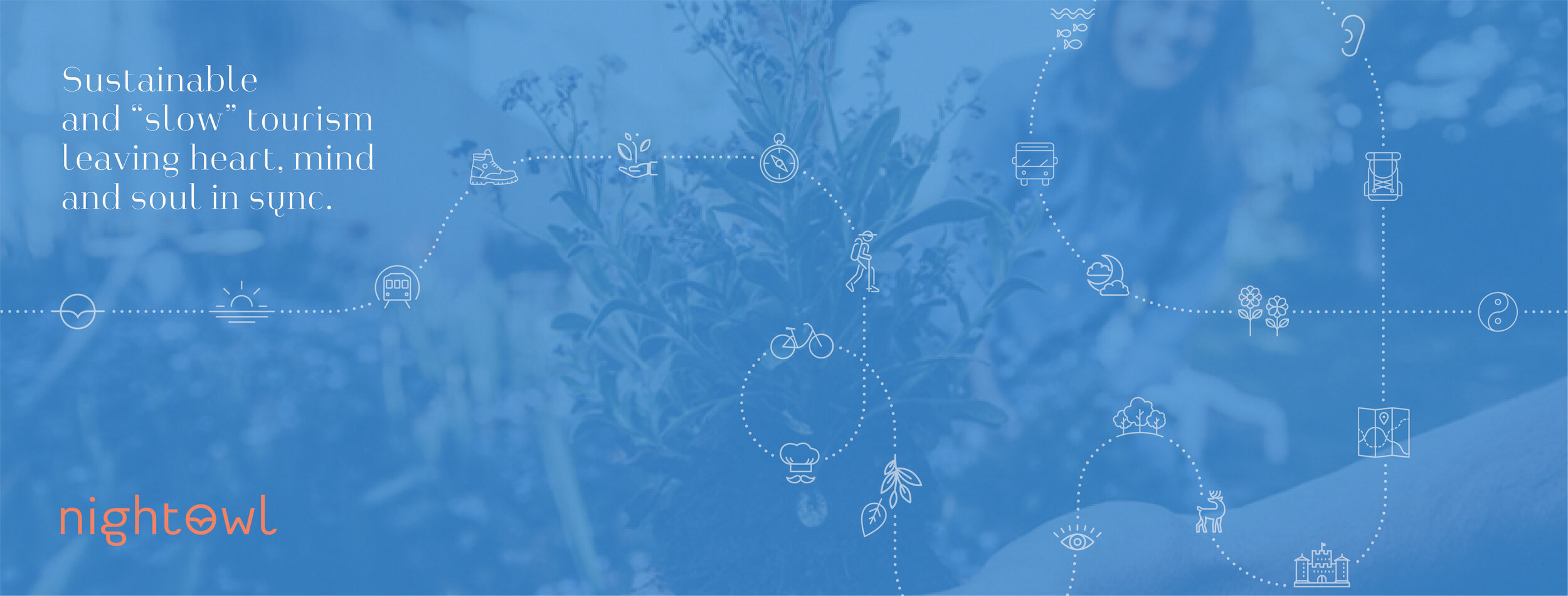
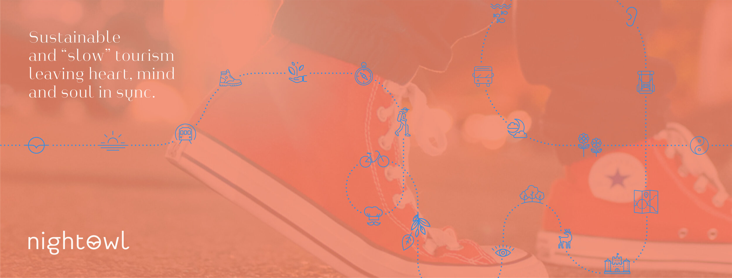
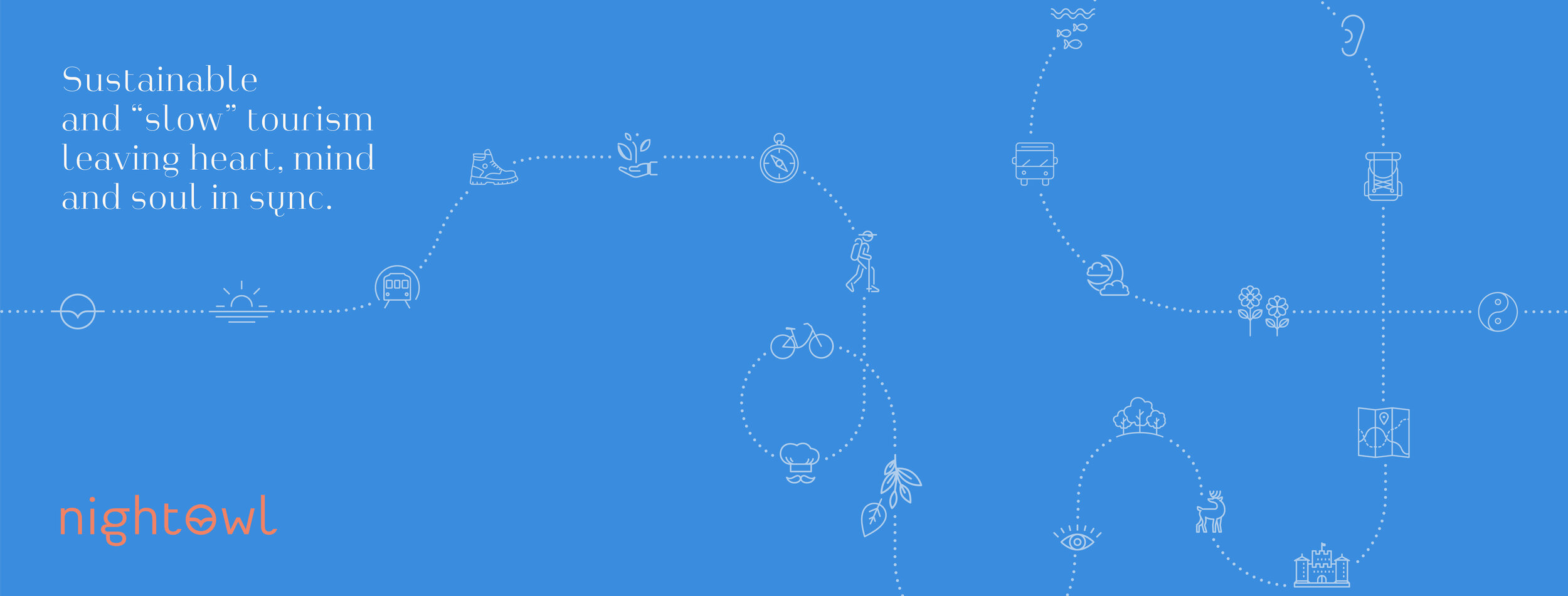
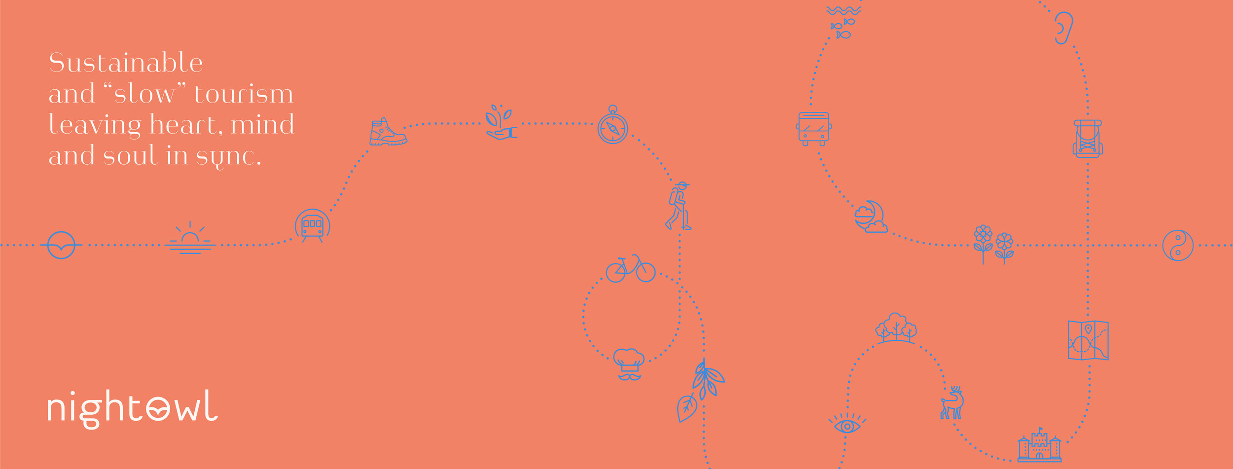
The geometrical icon that reflects everything in the company name – owl, horizon, sun/moon, aka your evening guided tours. The imagery and illustration support the ‘why’ in an emotional sense. Nightowl emphasises the use of our senses and dedicates every guided tour, to experience and feel in balance. The new identity oozes curiosity and zen.
The nordic colour palette is a modern take on the Danish colours of nature. Orange, sky blue and a subtle beige for sundowns and sea green for our Scandinavian coloured ocean. Every colour can be coupled with another constituting a belief that each can belong - there is something for everyone.
Guides have, as a tradition, a bright red jacket on. We challenged this by creating an energetic orange, thus binding all aspects together from print, web to merchandise.
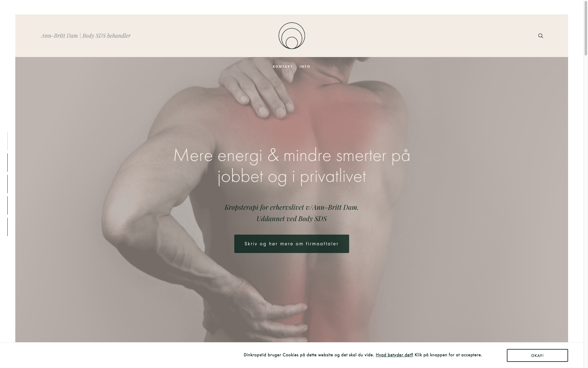
Webdesign – one page scroll and individual pages:
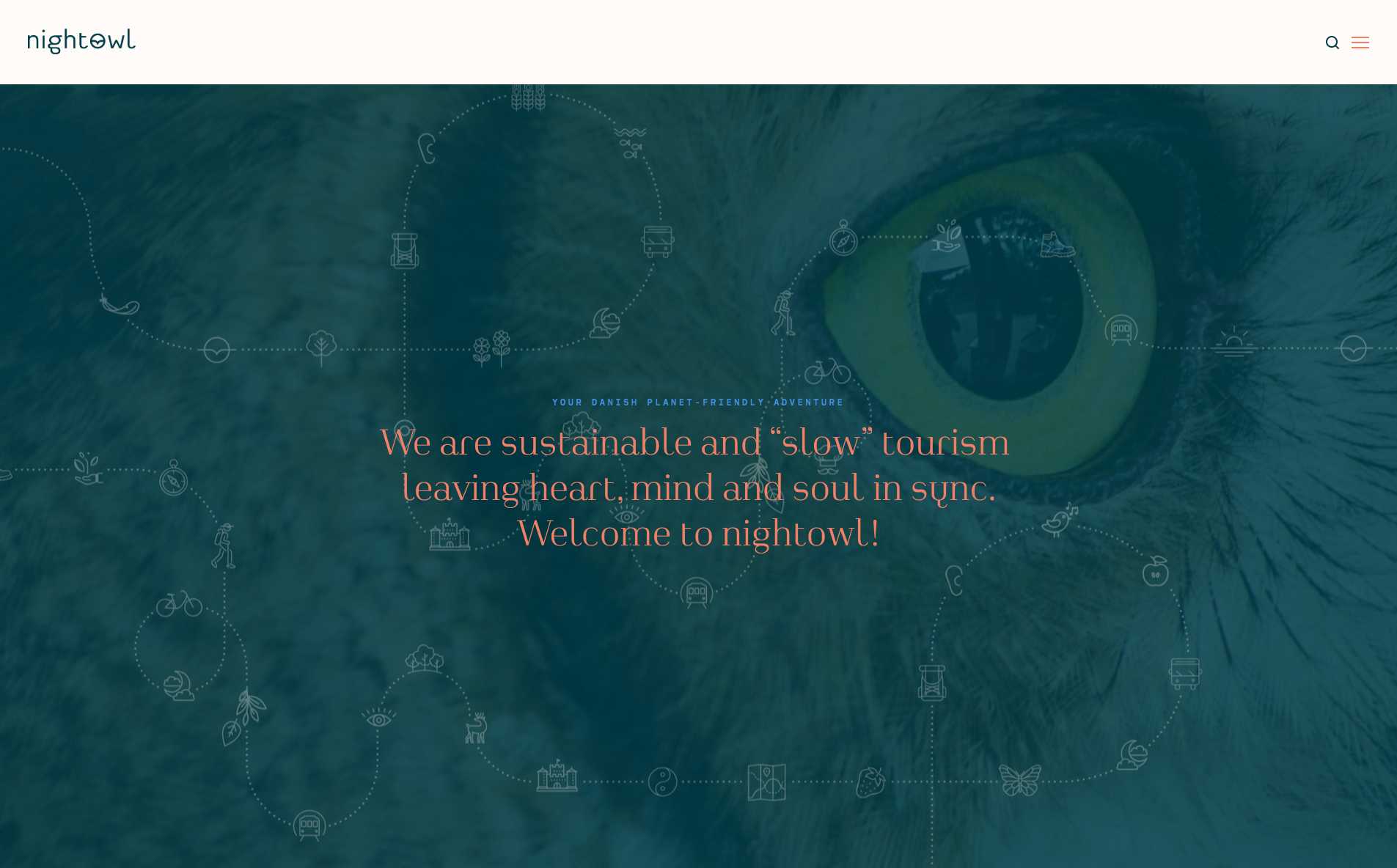

Images with great angles.

Nordic minimalism. A light beige background to soften up the over-all appearance.
Content heavy pages – clean and user-friendly layout:

Custom made icons that reflect a Nightowl Denmark experience. Fonts with great versatility and legibility
Responsive design – viewports:


Brand colours represented on each experience (guided tour)
Taking a brand further with a long-term design strategy.
This includes making the design guidelines flexible for usage on all platforms, be timeless and consist of more than just a logo.
Inspired by Jørgen’s vision I decided to make his brand stand out with a strong reference from nordic minimalism. Signature colours and an an illustration consisting of various icons combined. Much like what you can expect when on a guided tour with Nightowl Denmark.
This illustration (see above) carves a line across the media – like the social banners that Jørgen can choose between to make his social media dynamic – combined with the wordmark and copywriting, makes for a distinct visual expression, supported by the Nightowl values.
So much is happening on Squarespace!
If you need assistance, feel free to reach out.
Untill next time.
/ Ciao, C