'Welcome'-page with banner, action buttons and a modern navigation to the left, shown with lines, wrapped up in a white frame.
A one-page-scroll website, consisting of 5 pages in a long scroll and 4 individual pages in a second navigation.
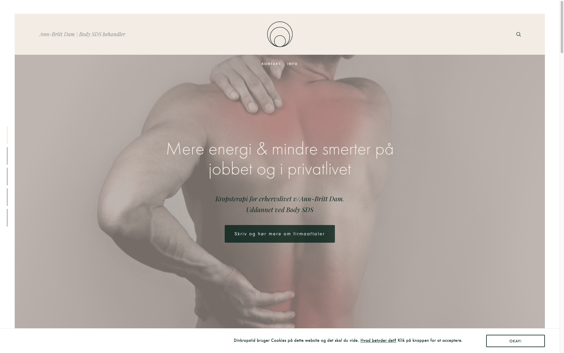
Throwback to this website i designed for 'Dinkropstid Erhverv' (Body sessions targeted for officepeople) where i was free to design and do what I do best. Overseeing every detail in a harmonic collaboration – these are my absolute favourite projects!
Only two requests, was to implement an earthy beige tone and a minimalistic design
Clean nordic design, balance, space and going for that little extra, in every project, is my speciality. This time, I went with a dark green for all buttons and fonts. Choosing images with no background fuzz to carve out my client's main concept; relief to office related body aching. I edited them from color to soft greys and photoshopped a pink color to show areas with pain.
Ann-Britt had a logo. This is used on her other website dinkropstid.dk. But i took the liberty to change it's color from grey to dark green and only use the submark. Often times, logos come without any guidelines or longterm design thoughts behind. So I am the creative, who ties the knot, modernizes and makes the designs come together.


Keeping the visual concept on all images, means a lot of photoshopping. At handover, the client always gets the original stockimages and the edited, for social media usage. It's important to be able to help with the over-all expression and keep the appearance on every medias ad platform, coherent. That's what concept development means ;-)

Action-banner to inform of client's other website and field of exertise. Keeping a bit of the color in big banner images through-out the site. Consistency is key.

Use of the logo submark to bring natural breaks and space. Copywriting and choosing fonts with great versatility

Website footer (bottom with contact information) columns and caps.
Big banner images, with parallax-scrolling.

Pop-up contactform activated by an action button.

The 'About'-page: 2-column design on all other text-heavy pages on the website.
As you may come to notice, i have written a few words to Ann-Britt Dam about her bodysessions. I
rarely do recommendation – unless they really truly are THAT GOOD. She deserves it! Keeps my body in check.
So much is happening this year on Squarespace!
If you need assistance, feel free to reach out.
Untill next time.
/ Ciao, C