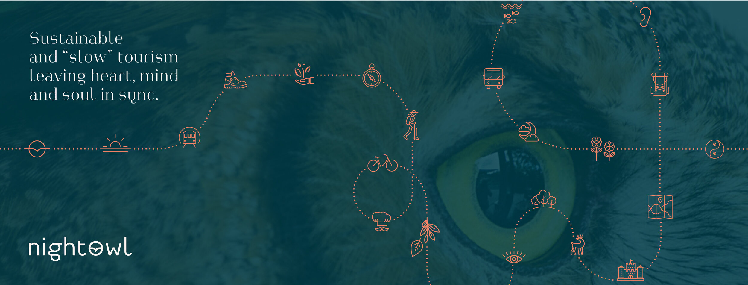
Banner design for social media.
Since their launch in October 2020, The Empty Square, founded by Julie and Simon from LivingCities, has already gained a positive response and support from over 25 countries so far.
The visual identity, and blog website is an extension of their brandingsite for LivingCities. So, intentially I designed their logo submark (L and C) to have just the right amount of abstractness and flexibilty, so it could be used on the blog aswell.
Dive in the conversation on their social media channels.
Visit: Theemptysquare.org for more information.
GRAPHIC DESIGN · WEBDESIGN

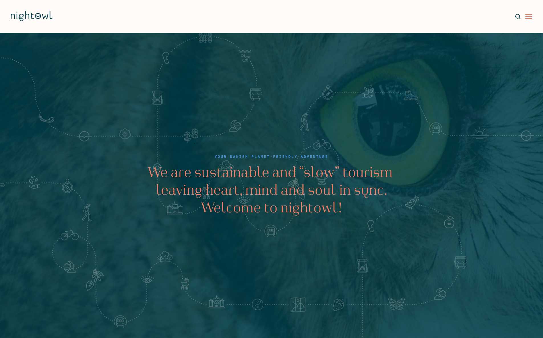
The frontpage of the blog’s brandingsite with easy access to filtering blogposts.